


A powerful solution for social media management
Our all-in-one social media management platform unlocks the full potential of social to transform not just your marketing strategy—but every area of your organization.
No credit card required.
#1 Best Overall Software | 2024
Top 50 Products for Enterprise, 2024
Top 50 Products for Mid Market, 2024
Top 50 Global Software Companies, 2024
Top 100 Highest Satisfaction Products, 2024
#1 Best Overall Software | 2024
Top 50 Products for Enterprise, 2024
Top 50 Products for Mid Market, 2024
Top 50 Global Software Companies, 2024
Top 100 Highest Satisfaction Products, 2024
Top 50 Products for Enterprise, 2024
Top 50 Global Software Companies, 2024
Top 50 Products for Mid Market, Winter 2024
Top 100 Highest Satisfaction Products, 2024
Trusted by 30,000+ world-class brands and organizations


Driving business impact should be easier
Sprout’s unified social media management platform enables your team to extract real business value, strengthen your market position and drive revenue—quickly.
See value faster
Get the insights your team has been waiting for—now. You won’t spend months onboarding, wondering how much of your budget went to learning how to use our platform.
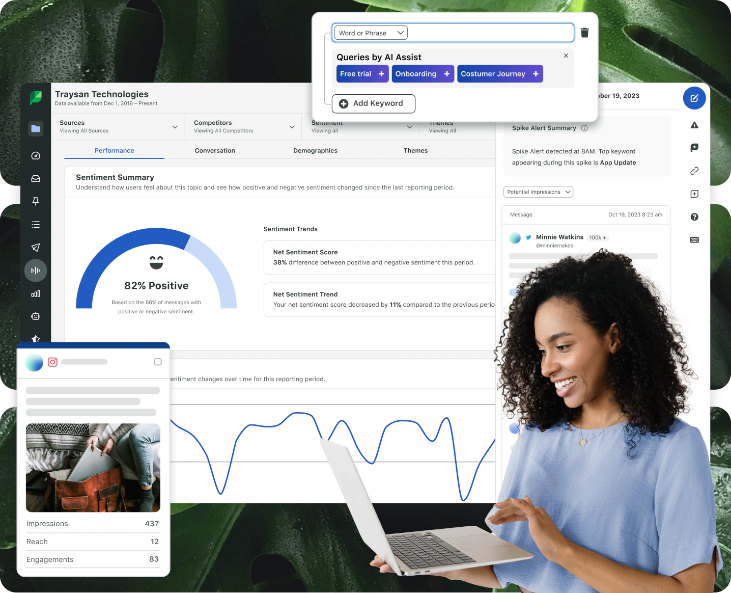
Capture insights with ease
Stay ahead of your competitors with a platform that guides you to make strategic business decisions based on accurate data with help from our advanced AI and Machine Learning (ML) technology.
Transition seamlessly
Elevate your business without rebuilding your tech stack. Our global Salesforce partnership and social network integrations make it easy to work within your current processes.
Sprout Social is named G2’s #1 Best Overall Software Product for 2024
Learn more about how sprout is the #1 best overall software product in 2024 based on G2 Reviews.
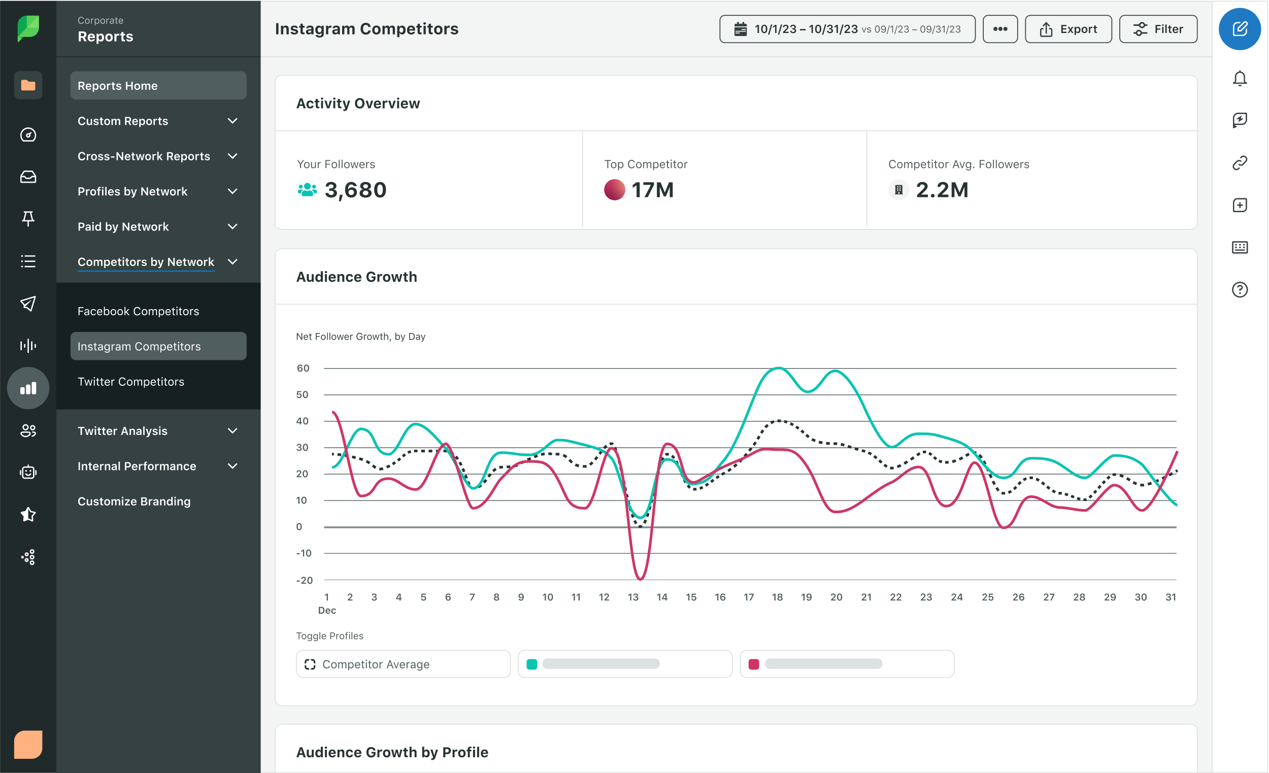
Prove the ROI of your social efforts
Drive business impact across teams with rich social data and dashboards.
- Analytics for Instagram, Facebook, TikTok, Twitter, YouTube, LinkedIn and Pinterest
- Create tailored reports that align with your business needs
- Easily share performance data with key stakeholders
Trusted partnerships & integrations across leading platforms
Sprout builds and maintains strong network partnerships and integrations to help you unify your customer touch points and keep pace with changes in the social landscape.

Grammarly saw a 80%+reduction in average time to first response
Trek Bikes saw a1,002%increase in total social engagements
Digital Natives saw a2xincrease in average client retainer
Enterprise solutions for social at scale
Need a comprehensive platform your team will love to use? Sprout is the clear choice. See how you can help impact your entire business, from industry insights and competitive intelligence to customer service, data and analytics.